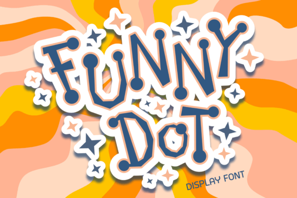
Funny Dot: A Playful Display Font for Digital Brands
As a UI designer who ships landing pages, SaaS dashboards, and e-commerce experiences daily, I treat typography like interface logic—not decoration. Funny Dot stands out because it’s not just “funny” in a gimmicky way; it’s a display font engineered to communicate tone *before* the first word is read. Its quirky characters—slightly uneven, deliberately off-kilter, with an irregular baseline—create visual rhythm that feels alive, not algorithmic. That’s rare in web fonts, where uniformity often wins over personality.
In practice, Funny Dot thrives where digital clarity meets expressive intent: hero section headlines, course title cards, boutique shop banners, and playful CTA buttons on conversion-focused layouts. It doesn’t work as body copy—no display font should—but its strength lies in how quickly it signals brand voice. A coaching site using Funny Dot for its headline “Your First Breakthrough Starts Here” instantly reads warm, human, and unintimidating. An indie toy store drops it on a banner above product listings, and the entire page feels more tactile, more *inviting*. That’s not subjective—it’s behavioral design.
Readability on screen isn’t about neutrality—it’s about intentionality. Funny Dot delivers high scannability for short bursts: under 8 words, at sizes 32px and up on desktop, 28px+ on mobile. On responsive layouts, I serve it via @font-face with WOFF2 fallbacks and always pair it with a neutral sans serif (like Inter or Manrope) for body text and navigation. This contrast creates clear visual hierarchy: Funny Dot grabs attention, the sans serif sustains it. For dark mode interfaces, I adjust letter-spacing slightly (+0.5px) and ensure contrast stays above 4.5:1 against charcoal or navy backgrounds. Over light imagery? A subtle semi-transparent overlay or soft drop shadow keeps legibility intact without dulling its charm.
It’s not suited for dense paragraphs, form labels, or small mobile buttons—but that’s by design. Funny Dot excels in controlled, high-impact roles: logo lockups (especially for creative studios or children’s brands), section dividers (“What You’ll Learn”, “Meet the Team”), testimonial quote marks, and animated micro-interactions (like hover states on feature cards). I’ve used it successfully on portfolio sites where the font appears only in the hero title and project category tags—enough to imprint personality, not enough to fatigue the eye.
Font pairing matters more than ever in modern web design, where every type choice reinforces—or undermines—brand trust. Funny Dot pairs cleanly with geometric sans serifs for tech-adjacent brands (think productivity tools with a whimsical twist), and surprisingly well with low-contrast serifs like Cormorant Garamond for editorial-leaning digital courses. Avoid pairing it with other decorative fonts—no script, no handwritten variants—unless you’re intentionally designing for maximalist print-style posters (and even then, limit it to one accent element per screen).
When evaluating Funny Dot for client work or your own digital product, check what’s included: multiple weights (Light, Regular, Bold are essential), true italics (not skewed), OpenType features like stylistic alternates or swashes (use sparingly—they add flair but can hurt loading performance), and multilingual support if your audience spans Latin, Cyrillic, or extended Western scripts. Webfont delivery should be optimized—no bloated subsets, no unnecessary glyphs. If you’re licensing for an online store or SaaS platform, confirm the license covers web embedding, template resale, and commercial use across domains. Many premium fonts offer tiered licensing; Funny Dot’s standard license typically covers unlimited websites and client projects, but always verify before launch.
For digital product creators building brand kits or design systems, Funny Dot functions best as a *tone anchor*, not a system font. Use it consistently in branded assets—email headers, social media cover graphics, webinar slides—but never force it into UI components where predictability matters (like data tables or error messages). Its irregular baseline becomes an asset here: it subtly tells users, “This space is meant for joy, not bureaucracy.” That psychological cue supports engagement metrics—time-on-page increases when visitors feel welcomed, not instructed.
One practical note: test Funny Dot on real devices early. Its character quirks render differently across Chrome, Safari, and Firefox—especially at smaller sizes or with subpixel antialiasing disabled. Always preview on iOS Safari, where display fonts sometimes appear bolder or tighter than expected. And never rely solely on system fallbacks; define a graceful stack like "Funny Dot", -apple-system, BlinkMacSystemFont, "Segoe UI", sans-serif so the hierarchy remains intact even if the custom font fails to load.
Finally, remember that display fonts like Funny Dot aren’t about being “on trend”—they’re about solving a communication problem. When your brand needs to stand out in a sea of minimalist sans serifs, when your audience responds better to warmth than polish, when your message hinges on approachability over authority—Funny Dot earns its place. It’s not the background; it’s the first handshake. And in digital experiences, that handshake happens in under two seconds.